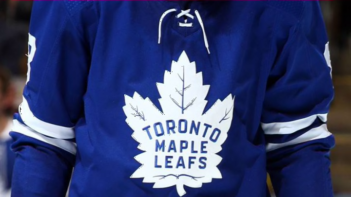
As the NHL revealed their reverse retro jerseys, the Toronto Maple Leafs new threads didn’t get a favourable reception from fans.
In what was supposed to be an exciting reveal of the new alternate jersey, it seems like the Toronto Maple Leafs got the short end of the stick after seeing their new reverse retro design.
Leading up to the announcement, many expected the Leafs to go with a similar style to the jerseys the team wore during the 70s and 80s with the white stripe along the arms and shoulders, the Maple Leafs crest that was a staple up until the rebrand in 2016.
Instead, the jersey seems to be a mix of that jersey with a different logo that resembles the one they had from 1967 to 1970 and brought back as an alternate in 2013. While the logo is certainly a retro look, there are so many issues with this design especially when you look at the jerseys other teams revealed.
Before I go into my critique of the jersey, here is what it looks like for those who might not have seen it.
Woven from the fabric of legends.
— Toronto Maple Leafs (@MapleLeafs) November 16, 2020
Introducing the #LeafsForever adidas #ReverseRetro jersey. Hitting the ice in 2021. pic.twitter.com/FFcAw8DTGt
More from Tip of the Tower
- Cam Phillips making his mark on Toronto Argonauts offence
- Toronto Argonauts: 4 storylines ahead of matchup against Redblacks
- Federico Bernardeschi ready for new challenge with Toronto FC
- Toronto Argonauts overcome Roughriders in entertaining Touchdown Atlantic
- Buffalo Bills: Von Miller drawing inspiration from Bruce Smith
Firstly, the logo throws off the entire jersey as the colours should have been reversed to a white leaf with blue letters. I get the desire to try something different but it just blends in too much as something that’s in the background.
I’ve always liked the white stripe that runs down from the arms and shoulders but the numbers on the arms don’t really look right as they have a bit of a grey undertone, unless that’s just the way the video looks.
"“It’s creating buzz and noise in the marketplace where normally we would be having games going on,” said Brian Jennings, NHL chief brand officer and senior executive vice-president to the Canadian Press. “We’re creating a lot of noise right now without the benefit of the live games.”"
The NHL is right, they are certainly creating a buzz with these jerseys when you look at the Colorado Avalanche getting their own spin of the Quebec Nordiques jersey. The Minnesota Wild took the colours from the Minnesota North Stars and made it their own and even the Carolina Hurricanes are using the Hartford Whalers jerseys with a slight change to the colours.
Then you look at the Leafs jerseys and while some will say they like the design, it seems like a majority (especially younger fans) are not in favour of the new threads. If there was a jersey to bring back, the Leafs could have played off a concept involving the alternates they wore during the 2000’s.
The #Leafs had an easy jersey design to bring back and it was this one. Probably my favourite jersey of all time. pic.twitter.com/cAs5M5rC3v
— David Morassutti (@d_morassutti) November 16, 2020
Maybe over time, the jerseys can grow on us when we see them on the ice but safe to say, Toronto could have gone in a different direction considering the rich history the team has with different logos and jersey designs.
What do you think about the Leafs’ current reverse retro jersey? Do you think they aren’t as bad as some are making it out to be? Let us know in the comments below.
